Check mobile optimisation
Over 60% of all website visitors come from smartphones. Check for free whether your website is mobile-optimised.
- Mobile analysis
- Touch optimisation
- Responsive design check
- Concrete improvements
Request mobile check
I will get back to you as soon as possible.
100% free & non-binding
What does the mobile check examine?
A professional mobile review covers various technical and design aspects. I analyse your website with regard to the mobile user experience and identify areas for improvement.
Mobile optimisation is no longer a nice-to-have today, but a decisive success factor. Since 2021 Google primarily evaluates the mobile version of a website for ranking. A non-optimised mobile display can therefore have a direct impact on your visibility in search results.
Responsive design
Does the website adapt to different screen sizes?
Touch-friendliness
Are buttons and links large enough for finger navigation?
Loading speed
How fast does the page load on mobile networks?
Mobile usability
Is navigation on the smartphone intuitive?
Why mobile optimisation matters
of visitors use smartphones
Google prefers mobile pages
abandon slow pages
My Mobile Optimisation
If your website is not mobile-optimised, I offer the following services. Depending on the current state of your website, a complete redesign may make sense, or targeted optimisations may be sufficient. After the analysis you receive a clear recommendation with transparent cost estimate.
Why is mobile optimisation so important?
More than 60% of all website visits today are via smartphones or tablets – and this is continuing to rise. Those who do not optimise their website for mobile users lose potential customers every day. But it is not just about visitor numbers: since 2021 Google primarily evaluates the mobile version of a website for its ranking. This is called "Mobile-First Indexing". A website that looks poor or loads slowly on a smartphone directly loses visibility in search results.
Mobile users are also more demanding than ever: they expect fast loading times, easy finger navigation, readable texts without zooming and forms that can be filled in easily on a smartphone. A poor mobile experience leads to high bounce rates and lasting loss of trust. With my mobile check I identify exactly where your website has weaknesses on mobile devices – and how to fix them.

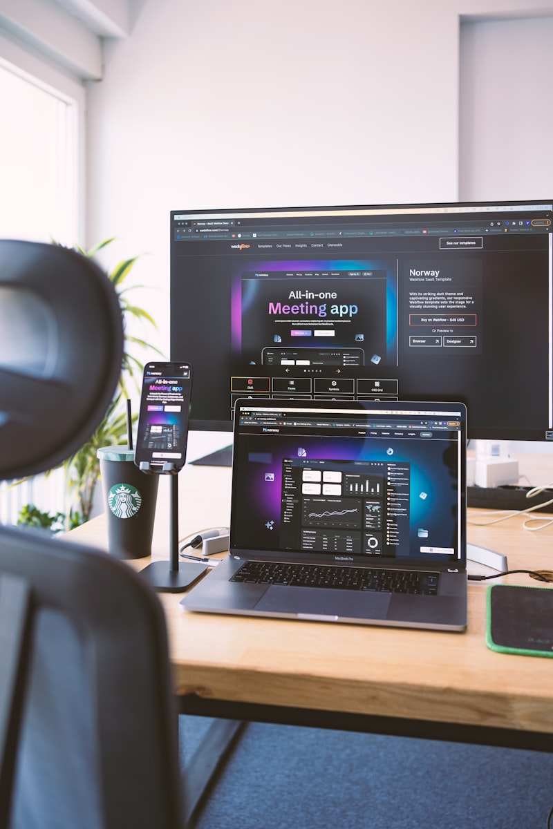
What I check in the mobile check
A thorough mobile check covers all relevant technical and design aspects. Here are the areas I examine:
Touch targets & buttons
Are buttons and links at least 44×44 pixels in size? Apple and Google recommend this minimum value so users can reliably tap elements with a finger. Buttons that are too small lead to mis-clicks and frustration.
Responsive layout
Does the layout correctly adapt to all common screen sizes? From small 360px smartphones to large tablets? I test on real devices and in browser emulators, paying attention to horizontal scrolling, overloaded layout and missing breakpoints.
Font sizes & readability
Texts must be readable on a smartphone without zooming. The minimum font size is 16px. Texts that are too small signal to Google a poor user experience and lead to a downgrade in ranking.
Load times on mobile networks
Mobile devices often use slower connections than desktop PCs. I test load times under simulated 3G and 4G conditions and check whether images, videos and scripts are optimised for mobile connections.
Forms on mobile devices
Forms are often problematic on smartphones: fields that are too small, missing auto-fill support, incorrect keyboard types (e.g. numbers instead of text for phone fields), unclear error messages. I check all forms for mobile usability.
Cross-browser & device compatibility
Your website must work equally well in Safari (iOS), Chrome (Android) and other mobile browsers. Differences in CSS support and JavaScript APIs can lead to unexpected display issues, which I specifically track down.
After the check: concrete measures
After the mobile check you will not receive a long list of technical terms that leaves you at a loss. I deliver a clear, prioritised action plan: what needs to be fixed urgently? What has the biggest effect? What can wait? I explain every point clearly and give you concrete solutions.
Optionally I implement the measures directly for you – from small CSS fixes to a complete responsive redesign. Depending on the findings, it may make more sense to fix individual problems in a targeted manner, or to lay a new foundation with a mobile-first redesign. After implementation we carry out a final test and you see the concrete progress: before/after on real devices.
Get your website checked
Send me your URL – I check for free whether your website is mobile-optimised.
Request now